A Calm Guide to iPhone Game Accessibility
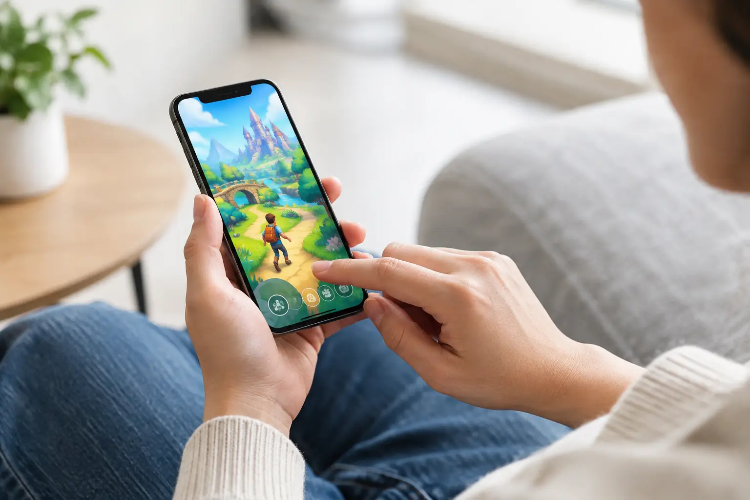
A good game can begin with one small, clear action: tap the bright gap, place a shape, find the next word. But that action only feels inviting when the screen, controls and pace leave room for you to play. This guide to iPhone game accessibility looks at the practical settings and design details that can make mobile games more comfortable, legible and enjoyable.
Accessibility is not one switch, nor is it only for a narrow group of players. A larger type size may make a puzzle easier to read on a train. Reduced motion can make an arcade game feel calmer. A controller might spare tired hands. Captions can make a small sound cue useful without requiring a quiet room. The best arrangement is the one that lets the game’s idea come into focus.
Start with the iPhone, not the game
Your iPhone has useful accessibility controls before any game is opened. They live in Settings under Accessibility, although the exact names and positions can shift slightly between iOS versions. Taking a few minutes to set up the phone can improve many games at once.
For visual comfort, look first at Display & Text Size. Larger Text, Bold Text and Increase Contrast can help menus, scores and instructions hold their shape. Reduce Transparency can make pale overlays easier to distinguish from a busy game board. Colour Filters may help if particular colour combinations are difficult to separate, though they can also alter a game’s intended palette. It is worth trying them in the actual game rather than judging from a settings screen alone.
Reduce Motion is particularly useful for games with sliding panels, screen shake or fast transitions. It will not remove every animated element, because games control some effects themselves, but it can soften system movement and make the phone generally more settled. If a game relies on a quick flash or a tiny moving target, less motion may reveal whether the underlying interaction is clear enough.
Zoom provides a movable magnified window, while Magnifier turns the camera into a separate tool for reading small printed material. For games, Zoom is usually the more relevant choice. It can make a compact interface playable, but there is a trade-off: magnifying the screen hides more of the board. Games built around a single object or a simple one-touch action tend to work better with it than games that demand a view of everything at once.
A guide to iPhone game accessibility controls
Touch is wonderfully direct when it works for you: finger meets glass, shape moves, action happens. It can also be imprecise, tiring or inaccessible on a particular day. iPhone offers several ways to change that relationship.
Touch Accommodations lets you adjust how the screen responds to taps and holds. You can ask the phone to ignore repeated touches, require a longer hold, or use the first or final touch point in a gesture. These settings may take a little experimentation. A longer hold can prevent accidental moves, for example, but it can make a quick reaction game less practical.
AssistiveTouch adds an on-screen control that can perform common gestures and actions. It is useful when pressing hardware buttons is difficult, and its custom actions can reduce the number of awkward movements needed around a game. Voice Control can also operate parts of the interface by spoken command. It is more helpful for launching a game, navigating menus and managing the phone than for a fast game that expects constant precise taps, but that distinction matters. Accessibility does not have to solve every moment to make play possible.
For players who use switches, Switch Control can scan through selectable items and activate them using external switches, the screen or head movement. Compatibility varies sharply from game to game. A game whose buttons are clearly exposed to iOS may be easier to navigate than one with a custom interface made entirely from moving artwork.
An Accessibility Shortcut can make frequently used features much less fiddly. Set it up in Accessibility Shortcut, then use the side button or another chosen method to bring up options such as VoiceOver, Zoom or AssistiveTouch. The point is not to turn every feature on. It is to keep the few that help within easy reach.
Make sound optional, not essential
Mobile games are often played in the small gaps of a day: on the sofa while someone else reads, in a waiting room, or with the sound off on public transport. Audio can add texture and confirmation, but a player should not lose vital information when it is unavailable.
Look for separate sliders for music, sound effects and spoken audio. Lowering music while keeping effects audible can make a puzzle’s feedback clearer. If a game offers captions, visual indicators or a vibration option for important events, try them. Haptics can give a tap a satisfying little weight, but they should support an action rather than be the only way to understand it. Vibration may be unwelcome or unavailable for some players, particularly during longer sessions.
If sound cues carry the whole game - an enemy approaching, a timer ending, a correct answer arriving - a visual equivalent is needed. This might be a clear icon, a change in contrast, a short written prompt or a calm pulse that does not depend on colour alone.
Choose games with room to breathe
No iPhone setting can fully compensate for a game designed around tiny targets, relentless timers or a crowded display. Choosing the right kind of game is part of accessibility, and it need not mean choosing something lesser.
A pause button is one of the most generous pieces of interface design. So are short rounds, restartable levels and progress that survives an interruption. A word puzzle can wait while you answer the door. A shape game can allow a mistake without turning it into a punishment. An endless runner may still be lively, but an uncluttered lane and one clear gesture can make its pace easier to read.
Consider the demands a game makes across a whole session. Does it require two hands? Does it ask for a rapid sequence of swipes? Can you play with the phone resting on a table? Are instructions presented once and then gone? Is there enough contrast between interactive pieces and decoration? A beautiful screen with sharp corners and soft colours can still be difficult if the important object disappears into the background.
For some players, colour-blind-friendly markers are essential. For others, the priority is text that can be read without squinting, or controls that do not require a pinch gesture. There is no single accessible style. Clear alternatives are more valuable than a claim that one approach suits everyone.
Small adjustments for calmer sessions
Comfort is often cumulative. Lowering brightness, using Dark Mode where a game supports it, and playing with the phone in a stable position can reduce strain. If accidental notifications break concentration, Focus mode or Guided Access can keep a session contained. Guided Access is especially useful when handing an iPad to a child or when you want to prevent an unintended swipe from leaving the game.
External controllers can be a good option for games that support them, particularly when holding a phone is uncomfortable or touch targets are demanding. They are not automatically better: a simple tap game may become less immediate with buttons, and controller mapping differs between titles. Still, having a choice can turn an awkward interaction into a familiar one.
It also helps to give yourself permission to change the rules around play. Turn off a timer if the game allows it. Use hints. Play one level and stop. Accessibility includes pace, confidence and the freedom to take the longer route to a satisfying answer.
What thoughtful game design looks like
For developers, accessibility begins before a settings menu. It begins with the question, “Can the player tell what to do next?” A strong answer might be a large tap area, a control with a text label, a palette that separates information by shape as well as colour, or feedback that arrives through sight, sound and touch.
Useful options should be understandable in plain language. “Screen shake: off” is clearer than a vague effects toggle. “Hold to confirm” should explain what changes when it is enabled. Defaults matter too. A game can be tactile and bright without forcing every player through rapid flashes, overlapping noises and tiny type.
At Tom Makes Games, the appeal of a compact game is often in that first contact: a tap, a placement, a small piece of progress. Keeping that contact clear is not an extra layer added at the end. It is part of making the object feel good in the hand.
The most helpful setup may be only one adjustment: larger text, a quieter soundtrack, less motion or a more forgiving touch response. Try the change that addresses the moment which feels difficult, then return to the game and see whether the play has opened up. The aim is simple: leave enough space for the satisfying part.