Why Shape and Colour Puzzle Games Feel So Good
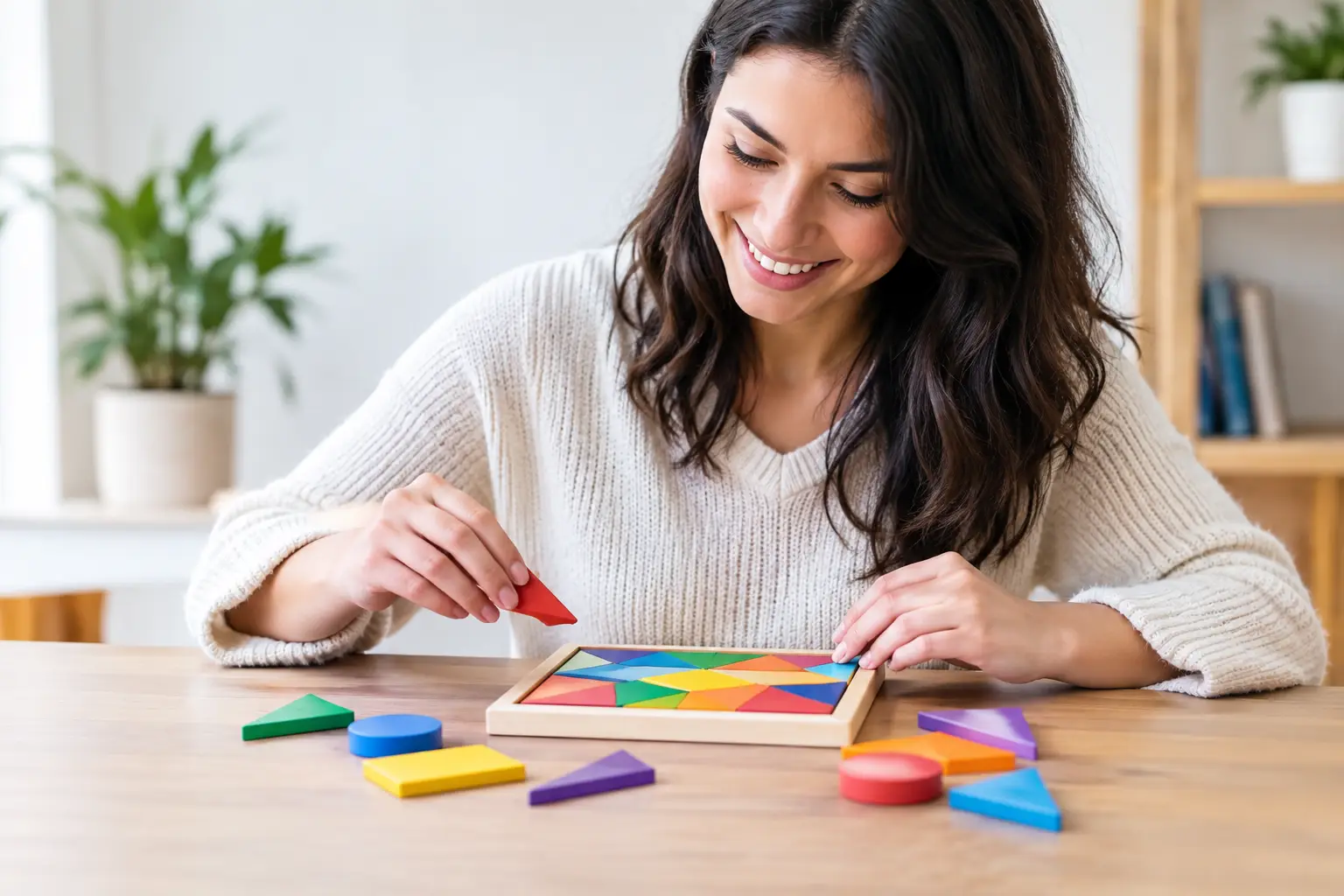
A small blue circle slides into the only gap that will take it. The board clears a little. A fresh arrangement appears, all sharp corners and bright spaces, and your next move is already beginning to suggest itself. Shape and colour puzzle games can make that tiny moment feel surprisingly complete.
They do not need a vast world, a countdown clock or a torrent of instructions. Their pleasure often comes from seeing clearly, deciding simply and watching a change happen under your fingertip. For a few minutes on a train, in a waiting room or with a cup of tea going cold beside you, that can be exactly enough.
The appeal of shape and colour puzzle games
Shapes and colours are among the first visual cues we learn to read. Before a puzzle asks us to calculate, it can ask us to notice: which piece has three sides, which tile is warmer, which space is still empty? That directness makes the rules easy to approach, but it does not make the play shallow.
A good board creates a conversation between what is obvious and what is possible. You may spot a red square that belongs in a red outline immediately. Then a second piece makes the first choice less certain. Perhaps placing it now blocks a longer chain; perhaps it opens a satisfying run of matches. The decision remains legible because the pieces are simple, yet it gains weight through their arrangement.
That balance matters on a phone or tablet. A player should be able to return after an interruption and understand the state of play at a glance. There is no need to remember a dense inventory, relearn a complicated control scheme or rush back before a timer ends. The puzzle waits, quietly, until you are ready to see it again.
Clarity is not the same as ease
The most lasting puzzles make their basic language clear without giving away every answer. Colour can establish families, priorities or paths. Shape can describe where a piece fits, how it moves or how it changes its neighbours. When both are doing useful work, each tile carries more than one small piece of information.
This is where visual design becomes part of the challenge rather than decoration around it. A pale triangle beside a dark circle should be distinguishable in a quick glance, but the difference should also feel pleasing. Spacing, contrast and motion all guide attention. A board with breathing room lets the player think; a crowded board can turn a thoughtful problem into finger gymnastics.
There is a trade-off. Too many shades, symbols and special effects can make a game look lively while making the underlying logic harder to read. Too little variation can make every level feel like the same task in a different coat of paint. The better approach is usually restraint: introduce one fresh idea, give it room to settle, then let it combine with what came before.
Touch gives the puzzle its weight
On a touchscreen, moving a piece is not merely an instruction. It is a physical gesture, however small. Dragging a tile into place, tapping a cluster away or rotating a shape until its corners line up gives an abstract rule a little weight and texture.
That is why feedback matters. A gentle click, a neat snap into a grid, a brief pulse of colour or a soft shift in the board can make a correct action feel assured. The aim is not noise for its own sake. It is confirmation: your choice landed where you meant it to land.
The same is true of mistakes. In a calm puzzle, an unsuccessful placement should be understandable, not scolding. A piece might simply return to its starting point, or the board may show the blocked edge for a moment. This keeps experimentation open. Players can try an idea, read the result and adjust, rather than feeling that one imperfect move has spoiled the session.
A pace chosen by the player
Many mobile games borrow urgency from arcade machines: alarms, streaks, expiring rewards and pop-ups asking for one more action. There is a place for pressure, especially when a puzzle is built around speed. But colour-and-shape play often has a different strength. It can invite concentration without demanding it.
Player-led pacing lets a difficult arrangement sit for a moment. Sometimes the answer comes into focus while you are not actively searching for it. A yellow piece that looked irrelevant begins to read as a bridge. An awkward L-shape becomes the key to clearing a corner. These are modest discoveries, but they are personal ones, and they make progress feel earned.
Short sessions benefit from this too. A puzzle does not need to provide an hour-long campaign every time it opens. One well-formed board can be a satisfying unit of play. Longer sessions can emerge naturally for players who want them, rather than being forced through escalating demands.
Difficulty should grow sideways as well as upwards
The usual idea of difficulty is more pieces, less space and quicker decisions. Those tools work, but they are not the only way to deepen a shape puzzle. New relationships can make the board more interesting without making it hostile.
A colour might change when two shapes touch. A piece may fit only when rotated, or a completed row may leave behind a useful empty space rather than simply disappearing. These additions ask the player to reconsider familiar objects. The rules expand, yet the board remains readable because the original language of colour and form is still doing the work.
This sideways growth is especially welcoming for players with different levels of puzzle experience. Someone looking for a quiet five-minute diversion can enjoy a straightforward match. Someone who enjoys planning can look for efficient arrangements, longer sequences or elegant solutions. The same system can meet both players without announcing one of them as the “right” way to play.
Colour needs care, not just brightness
Colour carries meaning quickly, but it should not carry meaning alone. If red and green pieces are important, differences in shape, pattern, position or iconography can support players who do not distinguish those colours easily. Strong contrast also helps in changing light, whether you are playing outdoors or on a dim evening bus.
Accessibility is not an extra layer pasted on after the puzzle is finished. It often improves the design for everyone. When a tile is recognisable by more than one cue, its purpose is clearer. When text is not tiny and touch targets are generous, the game feels less fussy. When motion can be reduced, the board becomes a calmer place to spend time.
A considered game also respects practical boundaries. Clear sessions, understandable settings and play that works without constant interruption suit the moments these games are made for. A puzzle should feel like a small crafted object in your pocket, not a machine asking to be fed attention.
The satisfaction is in the small change
The best shape and colour puzzles understand that delight does not always arrive with a huge score or a dramatic finale. It can be the instant a row settles into place, the clean disappearance of a cluster, or the pleasing mismatch that tells you to look again. Each move alters the picture, and each alteration gives the mind something fresh to hold.
For an independent studio such as Tom Makes Games, that attention to feel is part of the point. A simple action can have a distinct character: a shape turning under a thumb, a bright gap waiting to be filled, a quiet board becoming orderly one choice at a time.
The next time a puzzle presents a handful of coloured pieces, there is no need to hurry towards the solution. Let your eye travel across the board, notice the space between the shapes, and make the move that feels right. Sometimes a few clear rules are all that is needed for a satisfying pause.